you can see my blog for my political party but i did not want to put my reflections on that actually blog so i created this one to show my reflections.
the project went well to be honest i enjoyed working on a subject i thought was relevant the whole fact that we should have one of the people in power rather then the rich and elite which have sort of been born in to this upper class and have no real knowledge of hard graft. i also liked putting some humour in to it with the posters for example the David Cameron "Eaton mess" image. i also realised at this project that advertising was definitely the route i want to head down career wise, which i think as an outcome of this project is brilliant. i think if i did this task again i would maybe have done slightly more research so i had more background information
but all in all I'm happy with the outcome. check my blog for the political party and see what you think.
Monday, 3 June 2013
Sunday, 2 June 2013
snap cards

i chose 26 of the most commonly used types like cooper black for example is instantly recognisable due to the fact it is the font for easyjet.
this project came out well and i wanted to do typography with this project because this year i have sort of tried to avoid type as i am not the biggest fan of that whole aspect of graphic design but to my surprise i really enjoyed it and thought that as a product these snap cards really could be useful if i did this project again tho i would spend more time on it and actually get them printed design a box and try and see if i could manufacture and sell them to art shops like Cass art or something.
book project

this image was used to represent the battle between good and evil.
the two black strips going across the image work well to break up
the picture also have the text cut out of them . the top half represents good
the middle represents this battle in the middle swaying between good and evil
and the bottom represents evil. it just so happens the people at the top are
angels and at the bottom they are demons.
the text is actually the image
the colour of the text on the spine is actually the beige from the
picture which i think makes it work together better
didn't put name of author on the front cover because i didn't want
it to be to crowded with text its a very powerful image which i think need a
very simple composition regarding the font.
also their is no need for the name of the author because Dan brown
is one of the few people who's name is bigger then the book written
i kept the same font on the back and same colour because it reads
well on black
also i changed the saturation and hue on certain parts of the image
to emphasise the dark and light side.

this image worked really well because the sign of the ankh is actually hand made, tried a few digital images before this but they did not work this came out really slick tho. if i would do this image again i may change the text this one is not the most suitable i don't think.

Used spinning combination lock because I
think this is a lock that most people relate to a safe or something very
secure.
Have used the letter pressed text but
done the same thing as the previous book and cut the font out of the strip.
This is mainly so you can know the books are a set of 3.
I think the text for the title works well
due to the cracks and imperfections in it, my inspiration for that was the fact
the fortresses are supposed to be unbreakable but in the 21st
century a lot of these old medevil fortresses are actually falling apart and
not as strong as they used to be.
The background is a circuit board I used
this firstly because its obvious relation to the digital part of the title but
also in the book there is a lot of talk about computers and networks. And all
these little circuits represent that part of the story.
I changed the colours of the circuit board
because I wanted the circuit paths to be highlighted, but also I wanted it to
look like a negative image. Like it was having the flash hit it from a camera
taking a picture.
With regards to the strips being used again
on the front page I think this is not so much helping the composition it is
mainly for the point of these 3 books being designed as a set. I had another
idea for the composition but sadly could not use it ( refer to sketch book for
this image)
Also I changed the colour of the penguin
logo because I sore this had bin done before by other authors on some special
editions and I thought it was a nice touch
I like the I've only used 3 or so colours I
think it makes the book very easy on the eyes considering the image on the
front cover is very busy I think it does well to tone it down a bit
all in all i think these images worked really well and I'm happy with the outcome if i could do this project again i would have liked to have got these book covers printed and got pictures of them wrapped around actual books, and maybe sneek in to a book store and took pictures of them on a shelf. also i think as a set these work really well together you can tell they are a set by stripes and the text being cut out of the stripes
i think i did really well with experimentation with font on this task as well my sketchbook has a nice amount of experimentation with stencils, colours and printing. i tried letter press for the first time which worked really well for the type on the digital fortress book cover
i think i did really well with experimentation with font on this task as well my sketchbook has a nice amount of experimentation with stencils, colours and printing. i tried letter press for the first time which worked really well for the type on the digital fortress book cover
Friday, 4 January 2013
book cover project
with this task we were asked to re design three existing book covers the books i chose were Dan browns angels and demons, the lost symbol and digital fortress.

first i researched a few trilogy sets and narrowed it down to either Philip Pullmans spyglass trilogy, the lord of the rings trilogy or the Dan brown books. i went with Dan brown because i had read all these book sand knew the story their for felt i had an advantage with regards to relating the book cover to the story.
first of i printed a few different versions of publications of each book and decided what i liked about each one and what i didn't like so much this gave me an idea of what i could build on and what i didn't want cluttering my books.
the first book i decided to start with was Dan brown ANGELS AND DEMONS. first i looked at statues of angels in the Vatican and done a light sketch of a statue in st peters church just to get some inspiration but then i found myself drawn to this idea of gargoyles and what they were used for, they actually used them to ward of demons so its kind of like fighting evil with more evil. i like the idea of angels and demons at war with each other or tho I'm not religious i find this part of it all very fascinating.

so for my front cover of this first book i chose this painting called fall of the rebel angels by peter Paul Rubens which depicts angels fighting demons back in to the abyss which really relates to this book quote well, but also its just an amazingly eye catching image which if i picked up in a book store would defiantly make me read the blurb.
but then i wanted to explore this whole idea of good and evil and two conflicting sides further and it made me think about my star sign Gemini which is pretty much a good side and a bad side with me this rings true because i can go from being the nicest person in the world to a really assy person very quickly weather this is because i am a Gemini i do not know but i thought i would play on that whole idea. so i got an image of yin and yang and cropped my face in to each side then put a slight tint of red on one and a slight tint of blue on the other to symbolise this star sign this was more research than anything.
RED PROJECT
with this project we were asked to first find famous company logos and brand names which were displayed in the colour red for example Levis or tesco and then take one letter from each one and compose an alphabet out of them.
after this we were asked to then find sayings with the word red in them these are the quotes that i found
after this we were asked to then find sayings with the word red in them these are the quotes that i found
Red rum
Red tape
Red carpet treatment
Not worth a red cent
Caught red-handed
Paint the town red
Red sky at night shepherds delight
Seeing red
Red sails in the sunset
Better dead then red ( cold war slogan)
Red lorry yellow lorry
As red as a beetroot
Red and green should not be seen without a colour in between
Red headed step child
Roll out the red carpet
Better a red face then a black heart
then we were asked to design imagery for five of the quotes and then use the alphabet we have composed to form the quotes on the image.
the main aim of this task i think was layout and making imagery and text work together.
the sayings i used were caught red handed, seeing red, paint the town red, better dead then red and roll out the red carpet.
i think this project benefited me with regards to experimentation as i tried screen printing for the first time which i really enjoyed and gave me a broader range of medians to work with.
also i played around with composition which i had not really explored to its full effectiveness in my sketch book for the caught red handed image you can see that i sketched the text on to a b&w image a couple of times to find the perfect fit of imagery and text.
if i could do this task again i would defiantly spend more time on a few of them as i think certain images are stronger then others and personally i would like them all to be as strong as each other also have a bit more unity so they all work together.
these are the final images:


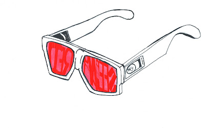
this image of the sunglasses is the one i screen printed
john ruskin text
we have been set a task to create some typography for a quote of our choice from either john Ruskin or William Morris. the typography has to have the appropriate font, layout and colour to reflect and emphasise the original meaning.
we will have to also research Victorian typography and reflect on its specific properties.
the best 3 typography pieces from the group will then be displayed on the walls of the wmc college for the royal visit
i started this task by completing a small task set to show our ability to relate typography to meanings of words hear is a picture to show my work

i then started to look at Victorian typography and came across an image of this Victorian text updated in a way that makes it quite modern and fresh i decided to recreate this in pencil and then do my own take on it with my own kind of italic hand writing on a scroll

this was the start of my research their will be more to come regarding the Victorian typography
i then moved on to finding a quote i liked and thought had a true meaning i decided to go with this quote by john Ruskin it goes like this " A LITTLE THOUGHT AND A LITTLE KINDNESS ARE OFTEN WORTH MORE THAN A GREAT DEAL OF MONEY".
this stands out to me because i find it very true money can change people in so many cases for the worse making you forget kindness and your general thought for others well being not in all cases
but in many. i then decided to hand draw this quote out in the italic/graffiti style i had used for the scroll on the image above.

so i decided to start designing my image with the help of my tutor tony and we came up with this for a first idea

i like this text because i wanted it to look bold and tall like the sketch i did of the Victorian text
so i completed the text and have now made five quotes and placed them on cups to be used in the canteen in the college the colours used remind me of s coffee shop because they are very natural and earthy
i think this worked well because i have taken materials used in everyday and integrated my art/design in to them and then placed them back in the real world.
i think this has showed me that i like making interactive design because the cups are designed to be used in the college canteen for tea and coffee. and i find when i have my morning cup of coffee that is my time to just sit and relax and think about the day ahead of me, these quotes on the cups are very thought provoking which i think works well.
all in all I'm happy with this project i think if i did it again i would actually get hundreds made and try and get the college canteen to use them on a permanent basis
my work was actually put up on the walls of the college corridor and they even decided to buy my cups i designed with the quotes on so all in all this project was a success.
they only bought them for £30 pounds but i would have been more then happy to donate them to the college for free because i made them for the college in the first place but I'm glad because its my first bit of work i have sold.


Wednesday, 17 October 2012
transformation task part 2
so today i have developed my asthma pump-smoking contraption idea for my final project and i am going to make an advert for it trying to sell it. i will call it "VENTODEATH" with a slogan like "WHY INHALE IT WHEN YOU CAN PUMP IT".
hear is the original image i will use

i will upload the final image once i have developed it in photoshop.
so hear is my first and main image for the posters i made i call it "VENTODEATH".
 so this is the first poster i did i think the background colour works well because an asthma pump is a medical device and the purple blue colour reminds me of the nhs and bupa colours, its also very similar to the colour of people national health insurance cards.
i used the font "neo contact" because that is the font used on Marlboro cigarette boxes and this is a smoking device so this text fits perfectly.
i also used this text to create the smoking catch phrase at the top all tho the smoking affect distorts it rather allot.
and the their is the smoke billowing out of the end of the asthma pump this is just to enhance it and making it a stronger and more shocking image and to let all the not so clued on people know what the vento death actually does.
then i put some small print in the rite hand corner saying "may cause slow and painful death after novelty wears off" because at the end of the day this poster is a piss take of a smoking advert and just an insane idea.
hears an image of my second poster i called "KEEP CALM AND INHALE"
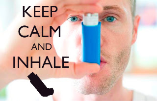 i chose this image because it shows the ventodeath in action and how to use it.
i then chose the font "gill sans" because this is the closest text i could find to the keep calm and carry on campaign of the 1930's.
i chose this text because in 1939 the British government released this campaign with the slogan "KEEP CALM AND CARRY ON" to try and boost the moral of the British citizen in the event of a Nazi invasion. the whole idea of it was to calm the nerves of the public.
but the slogan has bin recycled lately with regards to fashion and it is now a very in thing. so i think this makes my poster very current.
all i did was change the slogan to keep calm and inhale because this is what you should do in the event of an asthma attack or in the ventodeath's case an urge for nicotine.
also cigarettes are known to calm nerves and relax smokers so this image and text work very well together.
i also created another poster for a campaign to encourage the use of ventodeath the catch phrase is "hear to help" as in when your stressed and in need of a smoke ventodeath is hear to help. its quite a dark image but i was inspired by the government campaigns to stop car accidents, i cant quite put my finger on what i think they have in common its just something about the colours and how the text is sort of fading and coming out of the background at an angle. i will upload a picture shortly.
also hear is the image of my final design for the main poster as you can see the changes i have made make a great difference and i think it works much better then the pink purple image i showed you before
hear is the original image i will use

i will upload the final image once i have developed it in photoshop.
so hear is my first and main image for the posters i made i call it "VENTODEATH".
i used the font "neo contact" because that is the font used on Marlboro cigarette boxes and this is a smoking device so this text fits perfectly.
i also used this text to create the smoking catch phrase at the top all tho the smoking affect distorts it rather allot.
and the their is the smoke billowing out of the end of the asthma pump this is just to enhance it and making it a stronger and more shocking image and to let all the not so clued on people know what the vento death actually does.
then i put some small print in the rite hand corner saying "may cause slow and painful death after novelty wears off" because at the end of the day this poster is a piss take of a smoking advert and just an insane idea.
hears an image of my second poster i called "KEEP CALM AND INHALE"
i then chose the font "gill sans" because this is the closest text i could find to the keep calm and carry on campaign of the 1930's.
i chose this text because in 1939 the British government released this campaign with the slogan "KEEP CALM AND CARRY ON" to try and boost the moral of the British citizen in the event of a Nazi invasion. the whole idea of it was to calm the nerves of the public.
but the slogan has bin recycled lately with regards to fashion and it is now a very in thing. so i think this makes my poster very current.
all i did was change the slogan to keep calm and inhale because this is what you should do in the event of an asthma attack or in the ventodeath's case an urge for nicotine.
also cigarettes are known to calm nerves and relax smokers so this image and text work very well together.
i also created another poster for a campaign to encourage the use of ventodeath the catch phrase is "hear to help" as in when your stressed and in need of a smoke ventodeath is hear to help. its quite a dark image but i was inspired by the government campaigns to stop car accidents, i cant quite put my finger on what i think they have in common its just something about the colours and how the text is sort of fading and coming out of the background at an angle. i will upload a picture shortly.
also hear is the image of my final design for the main poster as you can see the changes i have made make a great difference and i think it works much better then the pink purple image i showed you before
Subscribe to:
Comments (Atom)